How to tell if a recipe’s nutrition numbers are real
General information, not medical or dietary advice. If you are managing a condition, your care team’s limits outrank any number on any website. Full disclaimer.
A nutrition panel under a recipe looks like a fact. Often it’s an estimate with nothing behind it, and a wrong figure is typeset exactly like a right one.
You don’t need a database to catch most bad numbers. Four of the five checks below are arithmetic and common sense. The fifth separates a recipe you can plan a condition around from one you can’t.
Calories aren’t an independent number — they’re what the protein, carbohydrate and fat add up to. Protein and carbohydrate carry about 4 calories per gram, fat about 9. Multiply them out and the total should land within roughly ten per cent of the stated calories. When it doesn’t, the panel wasn’t calculated — it was invented.
Per-serving numbers mean nothing until you know how big a serving is. The same lasagne is a triumph at eight servings and a disaster at four, so a per-serving figure with no serving count is decoration — and check the ingredient amounts agree with the count, because two chicken breasts don’t feed six.
Sodium is the number most often missing and most often understated, which matters because it’s the one most people are told to watch. Anchors worth carrying: a teaspoon of table salt is about 2,300 mg — an entire day’s general allowance. A tablespoon of soy sauce is roughly 900 mg. A cup of shop-bought stock is often 800 mg or more.
Calories, protein, carbs and fat are the easy four, and for many people they aren’t the ones that matter — kidney disease turns on potassium and phosphorus, heart guidance on saturated fat and sodium. A site that only ever shows the easy four usually doesn’t have the others. Absence is information.
This is the check that decides whether the rest can be trusted. Pick any figure and ask where it came from: can the site show you the ingredient behind it, matched to an entry in a food dataset, or is the number simply asserted? If nothing explains it, treat the whole panel as a sketch. Fine for a weeknight. Not fine for planning around a lab result.
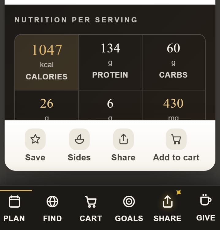
The arithmetic check runs on every dish, and a panel that fails it is repaired rather than displayed. Every recipe states its servings, and rescaling keeps per-serving nutrition per-serving. Sodium is on every dish and totalled against a cap you set; potassium and phosphorus appear when a renal need is on. Each ingredient line is matched against a bundled USDA-derived dataset, with the unmatched lines stated plainly.
Don’t throw it away — cook it, and stop treating its panel as data. A recipe can be a good recipe and a bad nutrition source at the same time. What matters is what you’re using the number for: curiosity survives a bad estimate, a potassium limit does not.
Multiply protein and carbohydrate by 4 and fat by 9, add them up, and compare with the stated calories. Within about ten per cent means it was probably calculated.
Because it’s harder to estimate than protein, carbohydrate and fat — it depends on brands, stock and how much salt is added — and because it makes recipes look worse.
That the dish’s ingredient lines were matched to entries in a bundled USDA-derived dataset rather than estimated. It isn’t a coverage badge: unmatched lines are reported, not hidden.